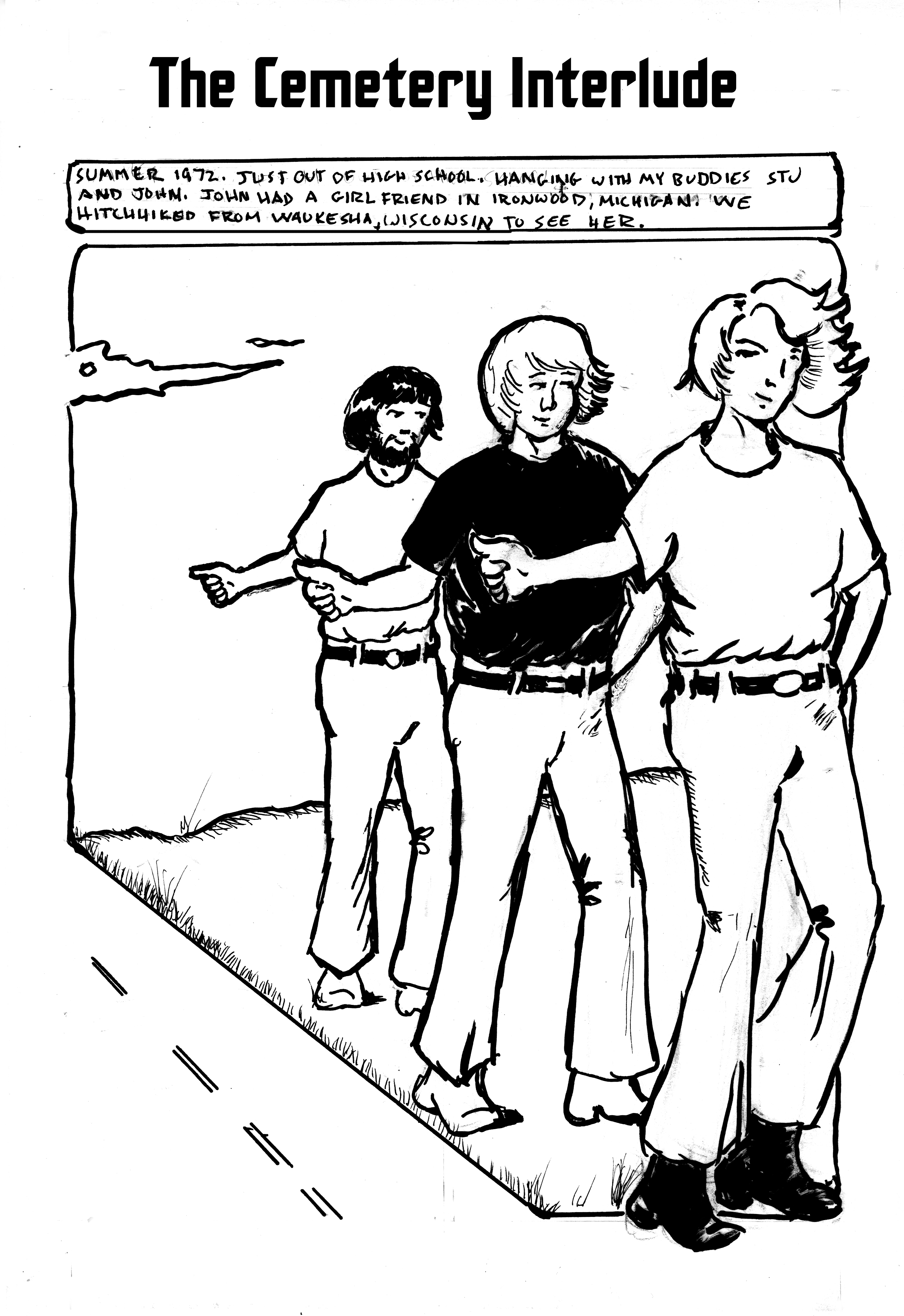
The next page of our interlude, in which the meaning of the title becomes apparent.

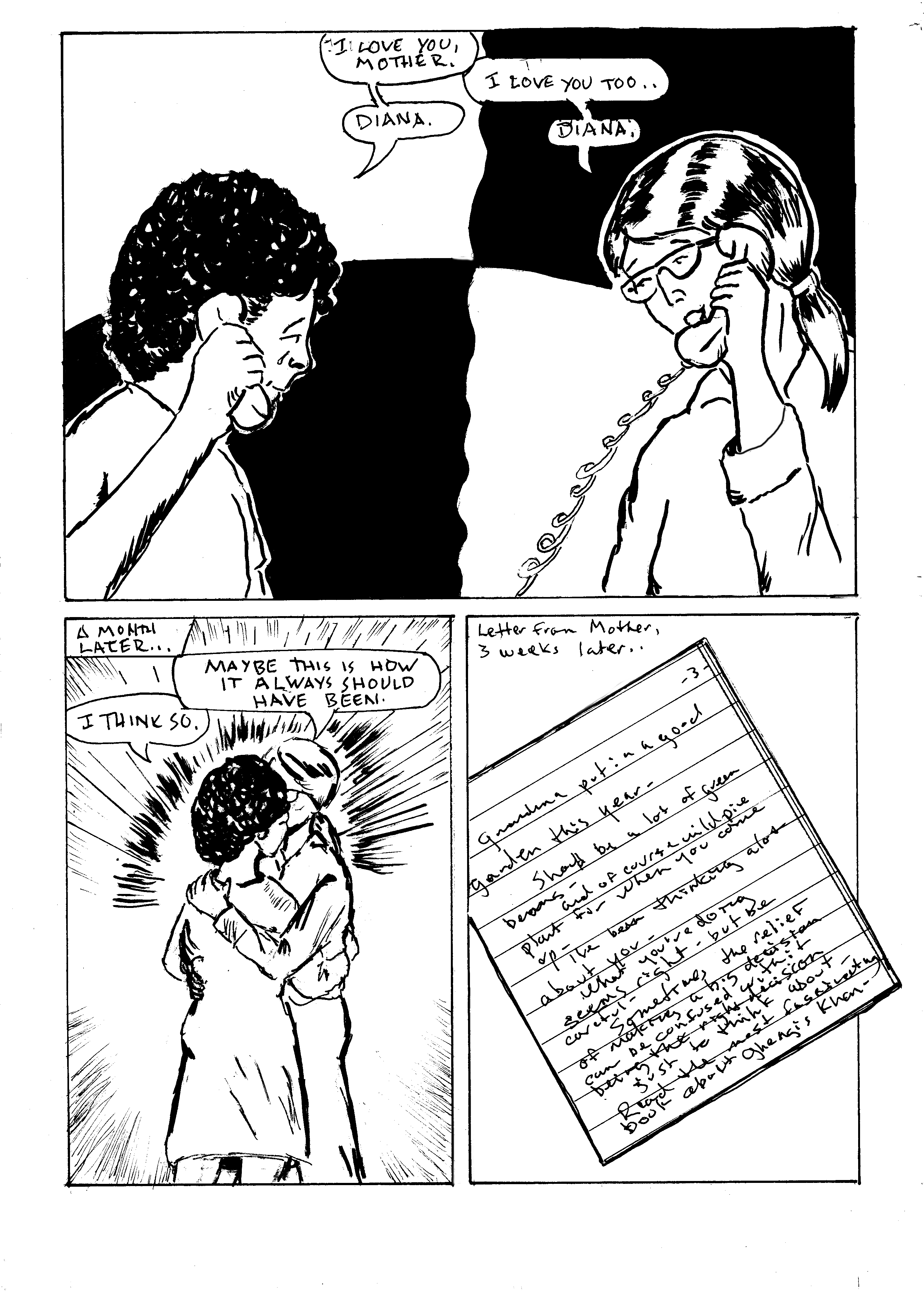
Continuing to work in Vaughn Bodé mode. The primary factors are the isolation of text and image, and the use of panel elements as parts of the borders. I wanted to keep the lettering loose but legible. To get the deep night effect, I toyed with a deep graphite over the inks, but finally decided on a deep wash, going for a misty effect.
The first panel went through several images. The problem was that it was too static. I mean, a bunch of people eating. I finally decided to concentrate on the emotions, to try to convey the sense of being fed after a long trip. This is the third or fourth time I've included a cemetery in a story. The challenge is that, despite usually strong upkeep, they are often desolate looking places. There's also a variety to tombstones and monuments that the casual observer overlooks. The 1987 Concrete story Now is Now is an excellent example of a well-drawn cemetery narrative. Leave it to the great Paul Chadwick! As regards the cemetery in THIS story, I'm pretty happy with the final result, but as I often do, I might tweak it before going to press. I looked up the actual cemetery, but it's visually boring, so I worked with memory and my renewed artistic license.
Including the rest of this interlude, there's less than 10 pages less to the Mother story. Then comes Daddy's Song, approximately the same length, 15 - 20 pages. I'm incorporating some smaller but significant story elements into these two chapters, so the book doesn't drag. I hope they're not offended, but several significant people in my life are mentioned only in passing, in the interest of advancing the narrative.
The final chapter is currently planned for 20 pages.
Foregoing tool list again this week. Suffice to say, nothing not frequently used before except a 1/4" Windsor Newton flat brush used for washes. I've had that brush forever- no idea where I got it! It's very floppy and works quite playfully.
Next: morning in the graveyard.